

Final Table
 Visit site

Final Table is a cross-platform mobile app that helps live poker players log their hands effortlessly at the table, and turns those sessions into results they can actually learn from.



The Challenge
How do you log a poker action in under 3 seconds, one-handed, without losing track of the table?
Standard mobile patterns fail this task. A form and a numeric keypad is too slow and too precise for a game where bets are ratios, not arbitrary amounts. A list of buttons doesn't scale to every size a player might choose.
The Solution
Final Table app with an
intuitive gesture pad
Tap to check, swipe to fold, hold and drag to raise. User can log hands while not losing the track of the game.
User Flow
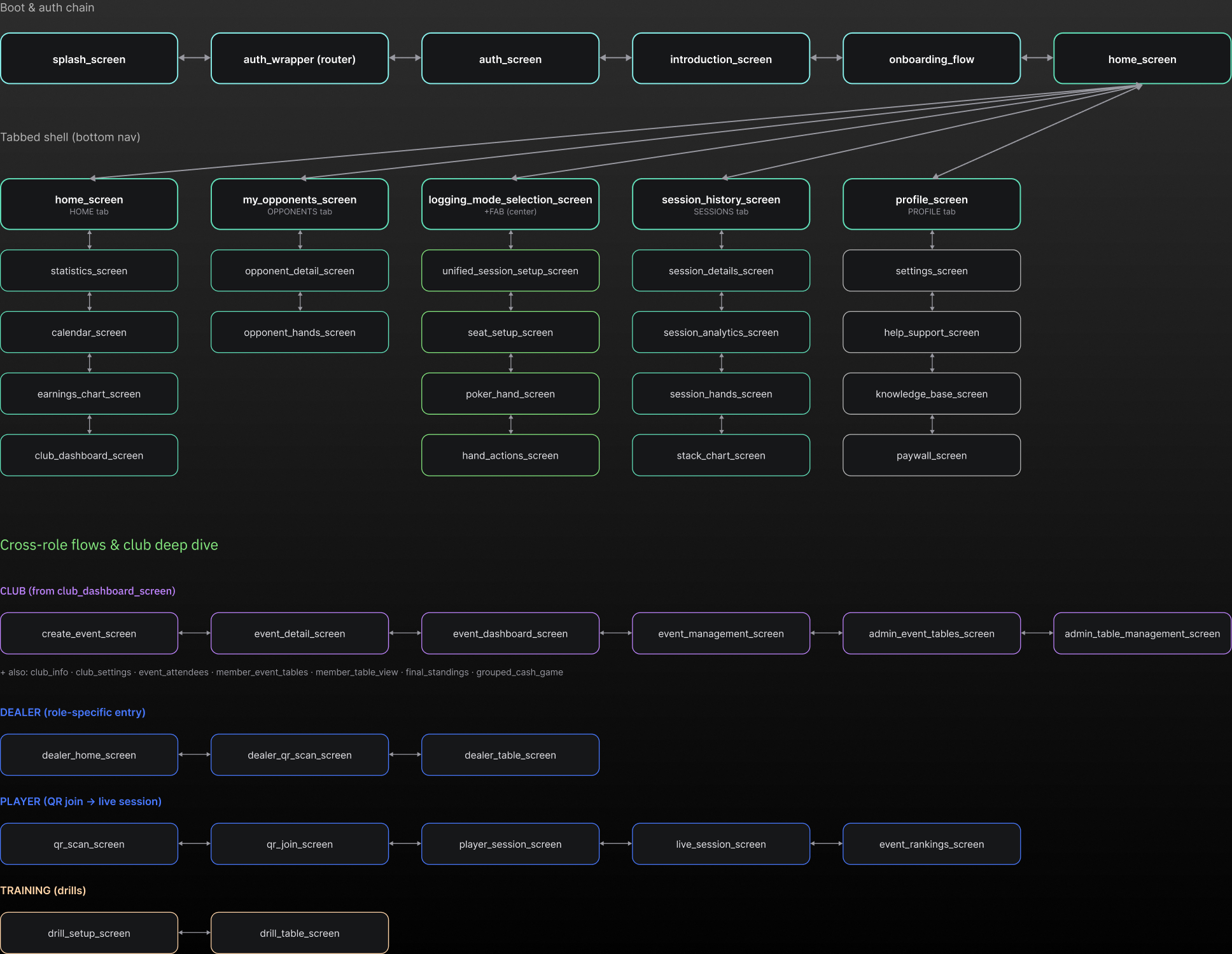
I mapped the user flow to
understand where users struggle
and simplify their journey
Let's start exploring what
we've built.

The Onboarding Flow
Five questions, asked to find out who is actually using it.
The app shipped into two poker clubs with no idea who would use it beyond that. Two clubs aren't a market, and store analytics tell you how many people downloaded something, not whether they're grinding four nights a week or playing once a month for fun.
So onboarding does double duty. It gets a player set up, and it asks the five things that would otherwise take months of usage data to infer: what they play, what they play for, how often, how experienced they are, and what they came here to find out.
This is research, not personalisation. The answers don't change the interface yet - they're shaping what gets built next.
Bottom Nav
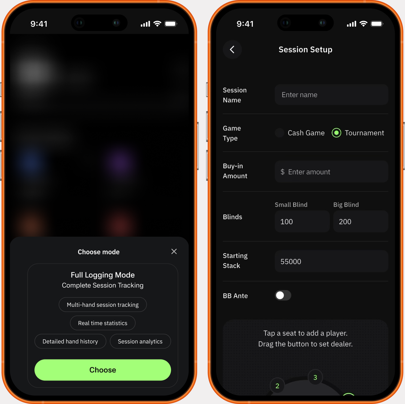
Get to logging asap
One distinct button and you’re already in logging mode.


The Gesture Pad
We wanted to let users log hands without losing the track of physical table
Poker players don't think in dollars. They think in ratios - 2.2x the blind, 3x, pot, all in. A keypad forces a translation from how the decision was made into how the app wants it stored, and that translation is where the seconds go.
So the input is shaped like the decision: a vertical drag with detents at the sizes that exist in the game. The value updates live as your thumb travels. Release, and it commits.
Typing survives as an escape hatch - release at the bottom of the travel and the field opens for an exact number, because the detents cover most bets, not all of them. And undo stays permanently visible, never buried in a menu, because a mis-tap at a poker table is inevitable and the recovery has to cost less than the mistake.
The Usability Testing
We conducted user testing with more than 100 players before the official launch.
And it worked! We got positive feedback and validation of the idea.
The only feedback we received was to add the table on top of the gesture pad. This way user wouldn’t need to memorize the game in their heads while logging, instead they could see both actions - hands they logged and game progress.

We fixed the snap zones
Weighting the snap zones
The first build spaced the detents evenly, which quietly assumed every bet size is equally likely. They aren't. Small raises are constant, all-in is rare, and the consequence of overshooting into all-in is not symmetrical with the consequence of overshooting into 3x.
After testing I widened the snap zones on the sizes players actually use, and tightened the one that hurts.
Add, edit, remove opponents
Know who you’re playing with
Review opponent profiles and past hand history before you sit down. Read the vibe so you adjust to your table. Know who is tight, who's wild and where the money is.

Logged hands and then what?
Analyse your hands
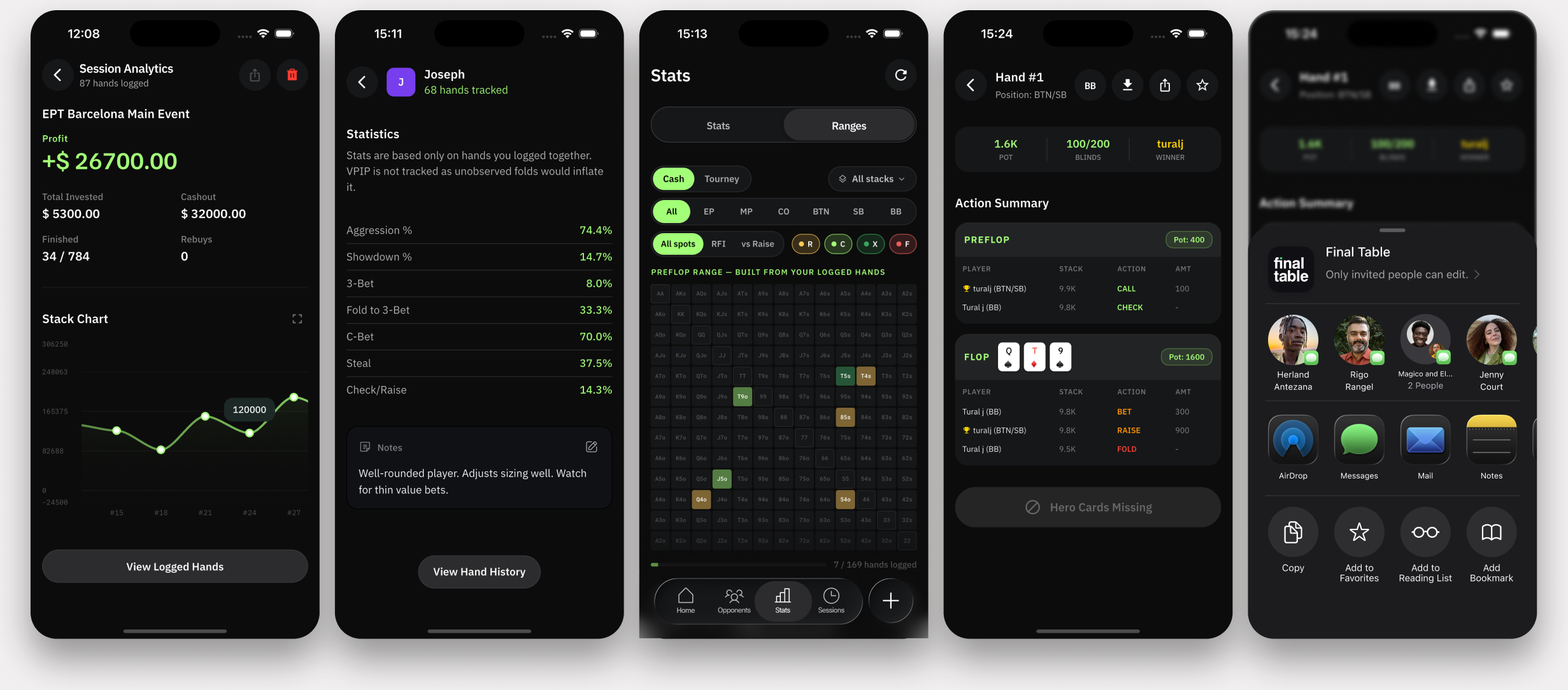
Review every hand, spot patterns in your play, share any hands with your friends, export solver compatible hand data and compare your decisions to GTO baselines. The data tells the truth.
Ranges
Build and study hand ranges for every spot. Visualise the hands you play, compare your decisions to solver-approved ranges, and tighten up the leaks in your game.
Bankroll Tracking
Set a bankroll goal and watch your progress. See your hourly rate, net profit, ROI and many more bankroll metrics.
Al Analysis
Get Al-powered insights on your play. Analyze hand histories, identify patterns, and receive personalized recommendations to improve your game.
Settings
Customise your profile
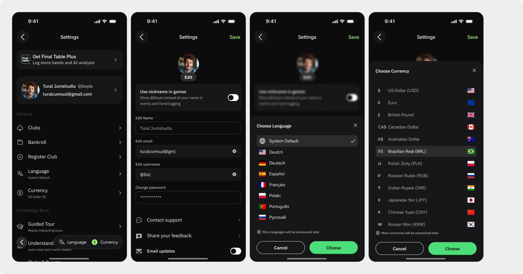
Implementation
Building the front end
Most of the interface came together fast, and the reason is the token layer rather than anything clever in the components. Every surface, text colour, radius and spacing step resolves to a named semantic token — bg/elevated, misc/button/bg, spacing/16 - so implementation had a fixed vocabulary to work against instead of a hex value chosen per screen.
I used Claude heavily through the build, and the tokens are what kept that from producing drift: constrained vocabularies generate consistent output, open ones don't. The design system stopped being documentation and became the thing that made fast implementation safe.
Static layout generates well; a gesture that has to feel right does not. The detent snapping was the specific problem - dragging produced values and releasing committed them, but the tolerances were uniform and the control felt slippery in use. That was hand-tuned against real thumbs at a real table.


One sheet component.
No duplicated chrome.
Every modal and bottom sheet in Final Table is the same component. The frame, toolbar, safe-area behaviour and action footer are defined once; what changes is the payload injected into a content slot. Sheet height is derived from that payload rather than drawn per screen.
- TOOLBAR
- A nested instance, not a redraw. Title, dismiss and grabber are inherited by all eight sheets — one edit propagates everywhere.
- CONTENT SLOT
- A real Figma slot. Any component can be dropped in without detaching the parent, so a new sheet costs one payload, not a new screen.
- ACTION FOOTER
- Three configurations: two stacked full-width, two side by side, or hidden. Sheets that resolve on selection carry no buttons at all.
- DERIVED HEIGHT
- The shell measures 184px to 790px across the set. Nothing was resized by hand — the payload sets the height.
Anatomy of the shell
Sheets full screen — one master component, three states: w/grabber, wo/grabber, Side buttons.

 Book a meeting